Projects

Tides of Change
A platform designed to connect people looking to get involved with ocean conservation with the right volunteer opportunities and organizations for them.
Role: Solo UI/UX Designer
Timeline: 9 weeks
Tools: Figma, Notion, Google Sheets
Project Overview
Tides of Change is a platform designed to connect people looking to get involved with ocean conservation with the right volunteer opportunities and organizations for them.
This quarter-long Digital Humanities project centers on UN's sustainable development goal #14, addressing ocean endangerment from plastic pollution, climate change, and overfishing. It aims to bridge the gap between people's concern for the ocean and their sense of empowerment in contributing to conservation efforts.
Challenge & Problem Statement
While looking for websites related to the Life Below Water UN Goal, I found that there was a lack of websites/platforms that served as a centralized source for people to get involved with an organization. Often they would only list individual ways to help such as "reducing waste", but the users were left to find a way to achieve their larger goals without any resources being provided. After identifying this gap, my question was:
How might I design an accessible digital platform that empowers users looking to make an impact in ocean conservation efforts by connecting them to volunteer opportunities and organizations that align with their interests?
Competitor Analysis
Heuristic Analysis & Usability Testing
To better understand the possible solutions that were currently available, I conducted heuristic evaluations of ocean conservation websites, identifying usability issues in user control, consistency, accessibility, and error recognition.
The main issue that I found was that many of the websites were tailored towards experts, and therefore unintuitive for average users.
Following this, I conducted a pilot usability test on the Funding the Ocean website, and asked the participant to complete various tasks the website offered and think aloud while doing so. I found that as expected, the participant had trouble narrowing down to local organizations, and specifically ones that had opportunities for community involvement.

User research
Contextual Inquiry
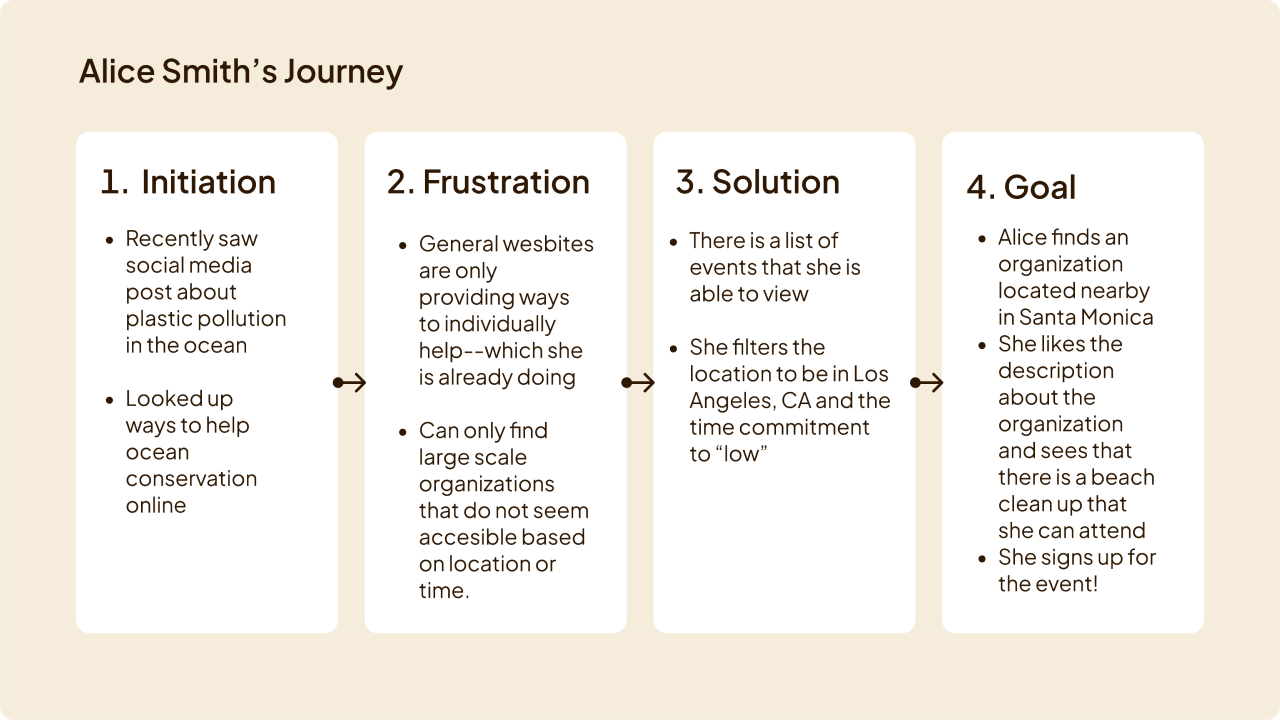
In order to achieve a better understanding of potential users for my site, I conducted a contextual inquiry with someone who was deeply involved with volunteer work. I focused on understanding what methods they used to find volunteer opportunities and organizations and what kind of information they value in their process. This information would guide the creation of a design solution for my target users.
Key insights derived from contextual inquiry:
- Simply providing information on a social issue is not enough to help individuals feed equipped to take action.
- While information may be accessible, it is not very helpful as it does not necessarily provide personalized resources for people.
- Those who are interested/experienced in volunteer work care about the reputation and “economics” of an organization.
- Time commitment is an important metric used to determine what event one would participate in, so displaying it is very helpful.
User Personas
I developed two personas and user journey maps to help me empathize with users and keep in mind who I would be designing the platform for. Based on the previous research conducted, I created personas that would demonstrate the motivations, thoughts, goals, and pain points that two types of potential users of my product would have.

User Journey
Design
Lofi Wireframes
I created low-fidelity wireframes to first focus on the functionality of the site and test the usability of these features early in development.
Feedback on Lofi Wireframes
I conducted a cognitive walkthrough to see how the user would interact with the site based on the elements on the lo-fi prototype and asked them to complete three tasks:
- Register for a volunteer event
- Find an organization
- Find resources
Through this, I learned that I needed to increase the visibility of certain elements on the screen and improve the clarity and intuitiveness of the feedback on the pages.

Design System
In creating the design system for the high fidelity prototype, I tried multiple variations for the typography, element shapes, and color schemes.
Articulat CF gave the site a modern feel, as the target users are Gen Z and Millennials. I also felt that the font was a great choice due its incredible readability.
I created light and dark modes for my design using shades of blue for my color palette. Blue evokes trustworthiness, reliability, and calmness It's crucial for users to feel confident and not overwhelmed when investing their time into the site. Lastly, I checked the contrast between the main components and text of the website and found that they all passed Level AAA WCAG guidelines.
Typography

Color Palette

Impression test
After creating the design system, I conducted a 5-second test, a mini-usability test, then an impression test with a volunteer and received valuable feedback. They expressed that they would have liked to see at least 6 of the events on one page before having to go the next page. To fix this, I added one more row of the event cards on the page and accordingly adjusted the grid layout.

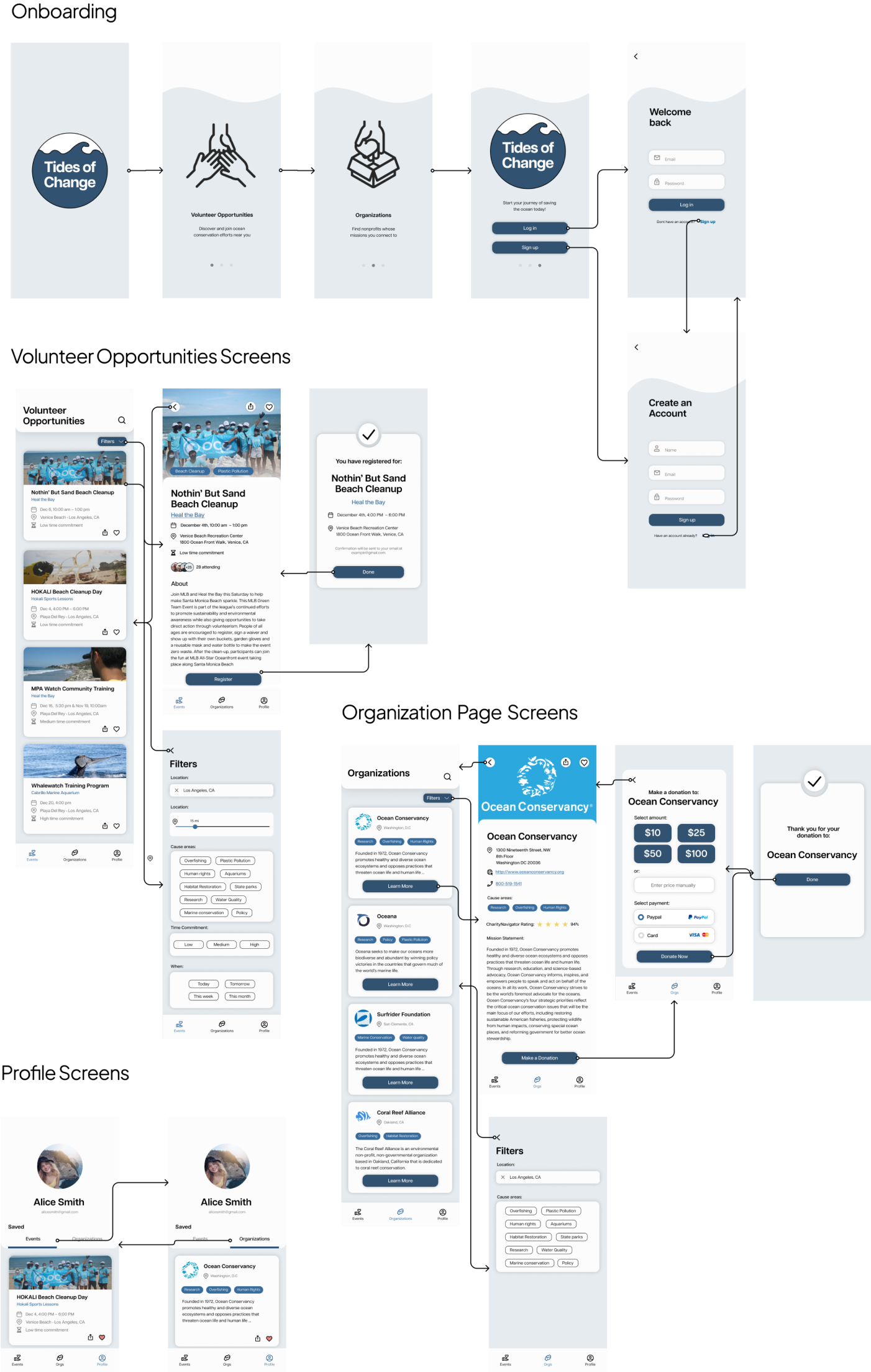
High Fidelity Prototype
I created my first high fidelity prototype based off the lo-fi wireframes and the design system and conducted a cognitive walkthrough with fellow classmates. I asked them to complete four tasks:
- Login/Create account
- Look for and register for a volunteer opportunity
- Find a nonprofit organization and make a donation
- Access saved events and organizations
In the first iteration, some users were surprised by the Volunteer Opportunities page upon logging in. They also found the Volunteer Organizations page confusing and wanted a more visible donation button.
To address this, I added two onboarding slides to explain the app's features, underlined the clickable organization names, changed the filter icon to a button labeled "Filters", and made the donation button fixed and always visible.
Based on this feedback, I created my final high-fidelity prototype.
📝
At this point in the project, my professor introduced me to the concept of mobile-first design, therefore I switched from working on a desktop design to a mobile design, but kept the same design system and functionality.
As the number of mobile users has surpassed desktop users, it was important to make this switch to increase the accessiblity of the platform and emphasize responsive design. This also forced me to decide which features are most important for my users to put on the screen, which led me to focus more on features that would connect users to opportunities push the resources page out of scope.
As the number of mobile users has surpassed desktop users, it was important to make this switch to increase the accessiblity of the platform and emphasize responsive design. This also forced me to decide which features are most important for my users to put on the screen, which led me to focus more on features that would connect users to opportunities push the resources page out of scope.
Features

Volunteer Opportunities
On the Volunteer Opportunities page, users can surf and view information about volunteer opportunities related to ocean conservation. They have the ability to filter by the type of work, location, distance, and time commitment and save opportunities to favorites.
Organizations
The Organizations page allows users to find and learn about organizations that that aligns with their interests and goals. They are able to support the organization by making a donation.


Profile
The Profile page serves as a hub for the user’s information, allowing them to view their favorited events and organizations.
Next steps and learnings
After making changes based on feedback, I conducted two usability tests on the prototype. The overall feedback was positive, with both participants finding the app easy to use, trustworthy, and with pleasing design. Their initial expectations of the pages aligned with the intended functionality. During task completion, participants had no difficulty but further improvements could be made to the app based on observations made during testing.
Problem
Solution
The participant had difficulty with onboarding page transition, likely due to uncertainty on how to navigate a mobile prototype. Second test participant was informed of how to interact with the prototype on mobile and did not encounter the same issue.
To make the design more accessible in edge cases like this, I could still add a button or side arrows to make it easier for the user.
First participant initially clicked entire card for Organizations instead of "Learn More" button, citing recent trend of entire card being clickable in apps.
To fix this, I could make the entire card clickable rather than only the learn more, or remove the learn more entirely.
When the second participant was asked to list the "Cause areas" of an organization, they did not list the cause areas with the pill design, but listed information that they found from the mission statement.
This could be easily solved by making the pills more visible to the user, either by making them larger or choosing a different way to display the information.
Final thoughts
Through the process of building a platform to connect users to volunteer opportunities and organizations in ocean conservation, I learned a lot about the importance of in-depth research throughout the entire process. The contextual inquiry, in particular, was enlightening in terms of learning about the context surrounding a potential user and gathering valuable information. I was able to implement certain aspects to the app based on findings from the inquiry, and the personas that I derived from it were instrumental in guiding the design process from the lo-fi to hi-fi wireframes.
The competitor analysis also provided insights into specific aspects that worked and didn't work for users, and the cognitive walkthroughs were helpful in identifying areas that could be improved in terms of accessibility and usability. Overall, I am satisfied with the current state of the app, but there are a few things that I would like to improve upon in the future, such as implementing a resources feature and making the organization pages more expansive. Lastly, I believe that the app would benefit from more usability testing.
Thanks for reading! 👋